The Reporting Dashboard provides customers quick insight into key metrics by store, area or company. By default, the Reporting Dashboard loads as a tab in the home page and includes the Key Metrics Graph, Comparable Sales Graphs, Top 10 Menu Items Sold Pie Chart, and the Business Day Snapshot. Click the image below for a 3 minute video tour!

Date and Unit Picker
By default, the Reporting Dashboard will load for the most recent business day. If your company has day part polling, the Reporting Dashboard will load with data from your most recent intra-day poll time.
The Unit selector will automatically default to the highest level of access provided to a user. For example, if a user has access to an entire company (all stores), ‘Company’ will be selected. Should a user have access to a select area or singular store, the area or store will be selected by default.
The date picker can be used to select a specific past date to review.
Key Metrics Graph
The Key Metrics Graph includes radio buttons to toggle between the following metrics:
- Net Sales
- Gross Sales
- Transactions
- Comps
- Promos
- Labor Hours
- Labor Dollars
- Labor Percent
All metrics referring to “Last Year” are comparing the selected business date to the same day of the week 52 weeks ago. Basically, you are comparing a Monday to the same Monday last year. If your team prefers to view the comparison to the same calendar date last year, please email support@qsronline.com to request the adjustment. This change will impact all users in that company.
Depending on your user access privileges, the Key Metrics Graph will load with one of the following:
- Company Snapshot – if a users privileges are set to provide access to the entire company, the Company Snapshot will load by default. For operators with more than 10 units where areas (groups of stores) have been created, then the WTD (Week To Date) comparison to Last Year will display showing the selected metric by area. If your company has 10 or fewer stores, the WTD comparison to Last Year will display showing the selected metric by store.
- Area Snapshot – if a users privileges are set to a specific area, the Area Snapshot will load by default. For operators with more than 10 units in a selected area, the WTD comparison to Last Year will display showing the selected metric by area. If your area has 10 or fewer stores, the WTD comparison to Last Year will display showing the selected metric by store.
- Store Snapshot – if a users privileges are set to a specific store, the Unit Snapshot will load by default, displaying the selected metric for the selected date, along with the comparison to last year.
Hovering your cursor over the current year bar graphs will show a tool tip including the percent change as compared to last year.
In the event a company has more than 11 stores, but has not created areas (groups of stores), then the Key Metrics Graph will display the Top 10 Performers defined as stores with the greatest increase compared to last year. To create areas for your stores, please email support@qsronline.com to request the adjustment.
Comparable Sales Graphs
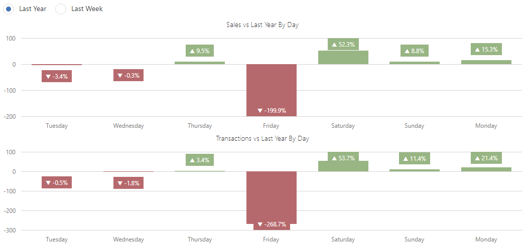
The Comparable Sales Graphs break out sales and transaction totals. The radio buttons at the top of this area allow you to select the Last Year comparison, or review the Last Week comparison for the last 7 business days. Hovering your cursor over any of the bar graphs provides a detailed breakdown.
All metrics referring to “Last Year” are comparing the selected business date to the same day of the week 52 weeks ago. Basically, you are comparing a Monday to the same Monday last year. If your team prefers to view the comparison to the same calendar date last year, please email support@qsronline.com to request the adjustment. This change will impact all users in that company.
Top 10 Menu Items Sold Pie Chart
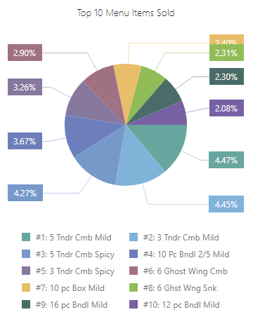
The Top 10 Menu Items Sold Pie Chart provides the ten highest selling menu items for the date and units selected. The highest items are determined by net sales percent.
Clicking on “a piece of the pie” or the correlating menu item in the list below will hide the item from the pie chart.
Business Day Snapshot
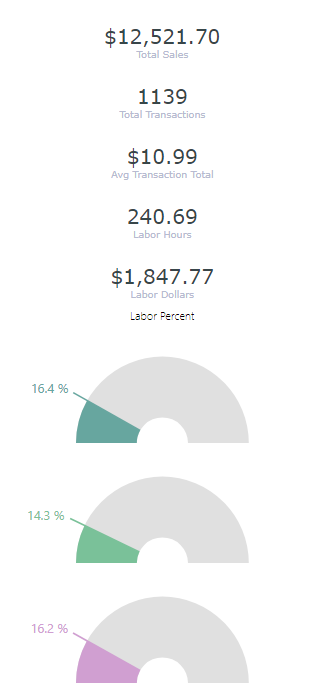
The Business Day Snapshot runs the length of the right side of the dashboard. This snapshot provides the total for all selected stores in the Unit and Date Picker and includes the following metrics:
- Total Sales
- Total Transactions
- Avg (Average) Transaction Total
- Labor Hours
- Labor Dollars
- Labor Percent (for the date selected)
- Last Week Labor Percent (for the same day of the week last week)
- Last Year Labor Percent
All metrics referring to “Last Year” are comparing the selected business date to the same day of the week 52 weeks ago. Basically, you are comparing a Monday to the same Monday last year. If your team prefers to view the comparison to the same calendar date last year, please email support@qsronline.com to request the adjustment. This change will impact all users in that company.
Setting the Reporting Dashboard to Load with Log In
To not impede your team’s ability to review the Corporate Message, the Reporting Dashboard loads as the second tab in the Home page. So upon login, the Corporate Message is viewed first, and users will click the “Dashboard” tab to access the Reporting Dashboard.
To make “Dashboard” the first tab that is viewed upon logging in, please see the General section of the Role Editor. As long as Administrators have access to the Reporting Dashboard, they can add or remove the Reporting Dashboard for other roles and set “Show the Dashboard in the first tab on the Home page.” This second setting will ensure that upon logging in, the Reporting Dashboard will be the first thing users see.


